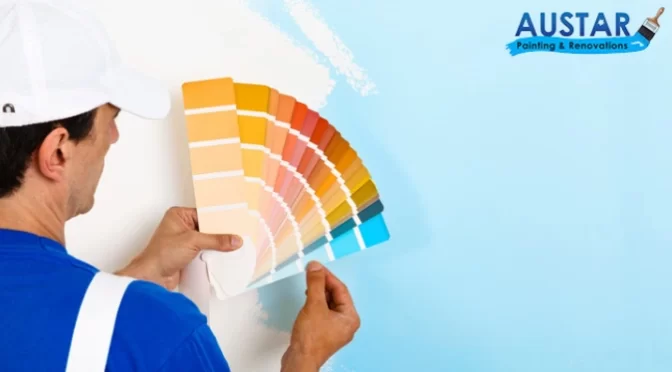
Beyond aesthetics, colour is a potent instrument that profoundly affects human emotions and behaviour. This is where colour psychology, an intriguing discipline that studies how various colours affect people emotionally and psychologically, enters the picture. Knowing and applying colour psychology strategically may revolutionise commercial settings in terms of drawing clients, establishing the ideal atmosphere, and eventually increasing sales.
Here, we have discussed the role of colour in affecting one’s psychology while opting for commercial painting in Melbourne –
The Science of Colour Psychology
The foundation of colour psychology is the knowledge that certain colours elicit particular emotional reactions. Red, for example, is frequently connected to vigour, passion, and excitement, whereas blue is connected to peace, calmness, and trust. Yellow is linked to joy, hope, and inventiveness, while green is frequently thought of as nature, growth, and harmony. These connections have a strong hold on our subconscious, affecting how we see the world and make judgements.
Examples of Commercial Spaces and Different Colour
If you’re hiring commercial painting services in Glen Eira for different kinds of commercial space, here is a guide –
Different Commercial Spaces
- Red: A traditional colour for impulsive purchases, red can pique interest and instil a sense of urgency. Fast-food restaurants and clearance areas frequently employ it.
- Blue: Promotes dependability and trust, which makes it appropriate for establishments that value client trust, such as banks and hospitals.
- Green: Green is frequently utilised in eco-friendly companies and health food stores, and it encourages calm and a feeling of well-being.
- Yellow: Perfect for kid-friendly shops and cafés, it can draw attention and create a happy mood.
Restaurants
- Warm hues like orange and red can pique interest and create a vibrant atmosphere, making them ideal for informal meals.
- Cool hues like blue and green can help people unwind and provide a more elegant setting, which is perfect for fine dining.
Workplaces
- Blue is a standard colour for office settings since it can increase focus and productivity.
- Green can boost employee morale and lessen stress.
- Yellow can improve communication and stimulate creativity.
Hotel
- In lobbies and common areas, warm hues like orange and yellow can create a warm and inviting ambience.
- In guest rooms, cool hues like blue and green might encourage calmness and sound sleep.
Colour psychology is a potent instrument for making business places impactful and captivating. Choose the right commercial painters in Cardinia to guide you in choosing the right colour for your commercial property.
Get In Touch With Us
Austar Painting & Renovations has the best team of commercial painters in Cardinia. We believe that quality work can do wonders for your commercial space and business. This is why we’re here to provide you with flawless application of high-quality paint finishes. Call us today for a quick consultation!

 Call us for quote